Interactive Form Elements
A form can have one or more form elements. You create a form by adding form elements to one or more pages of a PDF document. The form elements together constitute a form.
You can only have one form per PDF document.
FormElement
The FormElement class is parent to the following derived classes: Button, CheckBox, ChoiceField, ComboBox, ListBox, RadioButton, Signature, and TextField.
Do not confuse the FormElement class with the FormField class and its child classes!
CREATING a form uses the cete.dynamicpdf.pageelements.forms namespace while MODIFYING or completing a form using code uses the cete.dynamicpdf.forms namespace.
This page pertains to the cete.dynamicpdf.pageelements.forms namespace and the FormElement class and its children.
Properties
| Property | Description |
|---|---|
| BackgroundColor | Gets or Sets the fill/background color of a form field. |
| BorderColor | Gets or Sets the border color of a form field. |
| BorderStyle | Gets or Sets the BorderStyle . |
| Height | Gets or Sets the height of a form field. |
| ID | Gets or sets the ID of the page element. (Inherited from PageElement) |
| IgnoreMargins | Gets or sets ignore margin property. Setting False will consider the margin while placing the page element based on the RelativeTo property. (Inherited from PageElement) |
| MappingName | Gets or Sets an mapping name, of a form field. |
| Name | Gets or Sets the name of a form field. |
| Output | Gets or sets output options for the field. |
| Printable | Gets or Sets the form field printable on Pdf. By default it is True. |
| ReaderEvents | Gets the reader events of the annotation. |
| ReadOnly | Gets or Sets the read only property status of the form field. |
| RelativeTo | Gets and sets placement of the page element on the page. (Inherited from PageElement) |
| Rotate | Gets or Sets the angle of a form field. Rotation angle should be multiple of 90, default is 0. |
| Tag | Gets or sets the structure element of the form element. |
| TagOrder | Gets or sets the tag order of the taggable element. (Inherited from TaggablePageElement) |
| TextColor | Gets or Sets the color of the text for the field. |
| ToolTip | Gets or Sets an alternate field name, of a form field. |
| Visible | Gets or Sets the form field visible on Pdf. By default its True. |
| Width | Gets or Sets the width of a form field. |
| X | Gets or Sets the X coordinate of a form field. |
| Y | Gets or Sets the Y coordinate of a form field. |
Field Types
Interactive forms support the following field types.
| Field | Description |
|---|---|
| Button | Button fields represent interactive controls on the screen a user can click. They include push buttons, check boxes, and radio buttons. |
| TextField | Text fields are boxes or spaces in which the user can enter text from the keyboard. |
| CheckBox | Check Box fields are interactive controls that a user can toggle between. |
| RadioButton | Radio Button fields are a set of related toggles that at most one can be selected. |
| Choice fields (ListBox and ComboBox) | Choice fields contain several text items; only one value may be selected at a time. They include scrollable list boxes and combo boxes. |
| Signature | Signature fields are boxes or spaces in which a digital signature can be placed. |
Form field content can be validated for formatting or for auto filling values with JavaScript using AnnotationReaderEvents. Please refer to the JavaScript topic for more information.
Button
A Button inherits the FormElement parent class's properties in addition to its own properties (Button).
Buttons are associated with an action. Core Suite supports several actions, including submitting or resetting a form or custom JavaScript. For more information, refer to the Actions topic.
This example shows how to create a Button and add it to the page.
Button button = new Button( "Button Name", 50, 50, 100, 50 );
button.Action = new JavaScriptAction( "app.alert('Hello');" );
button.BackgroundColor = RgbColor.AliceBlue;
button.Behavior = Behavior.CreatePush( "downLabel", "rolloverLabel" );
button.BorderColor = RgbColor.BlueViolet;
button.BorderStyle = BorderStyle.Beveled;
button.Label = "Push";
button.TextColor = RgbColor.DarkGreen;
button.ToolTip = "Click";
Dim MyButton As Button = New Button("Button Name", 50, 50, 100, 50)
MyButton.Action = New JavaScriptAction( "app.alert('Hello');" )
MyButton.BackgroundColor = RgbColor.AliceBlue
MyButton.Behavior = Behavior.CreatePush( "downLabel", "rolloverLabel" )
MyButton.BorderColor = RgbColor.BlueViolet
MyButton.BorderStyle = BorderStyle.Beveled
MyButton.Label = "Push"
MyButton.TextColor = RgbColor.DarkGreen
MyButton.ToolTip = "Click"
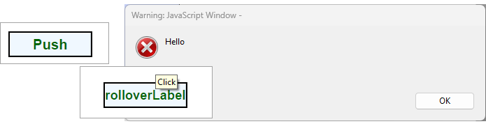
Figure 1. Button example.
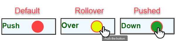
You can associate images with a button through the button's Image property. You can also set images for the button upon rollover and being pushed. However, you must set the button's LabelImageLayout which takes a LabelImageLayoutOptions value. Valid options are: ImageOnly, LabelBottomImageTop, LabelLeftImageRight, LabelOnly, LabelRightImageLeft, LabelTopImageBottom, and OverlayImage
Button button = new Button("Button Name", 0, 700, 100, 30);
...
button.Image = ImageData.GetImage("button-a.png"));
button.LabelImageLayout = LabelImageLayoutOptions.LabelLeftImageRight;
button.Behavior = Behavior.CreatePush("Down", "Over", ImageData.GetImage("button-c.png")), ImageData.GetImage("button-b.png")));
Dim button As New Button("Button Name", 0, 700, 100, 30)
...
button.Image = ImageData.GetImage("button-a.png"))
button.LabelImageLayout = LabelImageLayoutOptions.LabelLeftImageRight
button.Behavior = Behavior.CreatePush("Down", "Over", ImageData.GetImage("button-c.png"), ImageData.GetImage("button-b.png")))
CheckBox
The CheckBox element is a child class of the FormField class. The following example illustrates adding a CheckBox to the page.
CheckBox checkBox = new CheckBox( "Check Box Name", 5, 7, 50, 50 );
checkBox.DefaultChecked = true;
checkBox.ToolTip = "Check it";
Dim MyCheckBox As CheckBox = New CheckBox( "Check Box Name", 5, 7, 50, 50 )
MyCheckBox.DefaultChecked = true
MyCheckBox.ToolTip = "Check it"
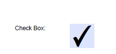
Figure 2. Check box example.
ComboBox
The ComboBox element is child class of ChoiceField, which is a child of FormElement. This example shows how to create a ComboBox and add it to a page.
ComboBox comboBox = new ComboBox( "Combo Box Name", 50, 75, 150, 25 );
comboBox.Items.Add( "One", true );
comboBox.Items.Add( "Two" );
comboBox.Items.Add( "Three" );
comboBox.BackgroundColor = RgbColor.AliceBlue;
comboBox.BorderColor = RgbColor.DarkMagenta;
comboBox.Editable = true;
comboBox.ToolTip = "Select";
Dim MyComboBox As ComboBox = New ComboBox( "Combo Box Name", 50, 75, 150, 25 )
MyComboBox.Items.Add( "One",true )
MyComboBox.Items.Add( "Two" )
MyComboBox.Items.Add( "Three" )
MyComboBox.BackgroundColor = RgbColor.AliceBlue
MyComboBox.BorderColor = RgbColor.DarkMagenta
MyComboBox.Editable = True
MyComboBox.ToolTip = "Select"
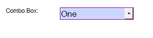
Figure 3. Combo example.
ListBoxField
The ListBox is a child class of the ChoiceField, which is in turn a child of FormField. This example shows how to create a ListBox and add it to a page.
ListBox listBox = new ListBox( "List Box Name", 5, 2, 100, 150 );
listBox.Items.Add( "One",true );
listBox.Items.Add( "Two",true );
listBox.Items.Add( "Three" );
listBox.BackgroundColor = RgbColor.AliceBlue;
listBox.BorderColor = RgbColor.DarkMagenta;
listBox.BorderStyle = BorderStyle.Dashed;
listBox.Multiselect = true;
listBox.ToolTip = "Select";
Dim MyListBox As ListBox = New ListBox( "List Box Name", 5, 2, 100, 150 )
MyListBox.Items.Add( "One",true )
MyListBox.Items.Add( "Two",true )
MyListBox.Items.Add( "Three" )
MyListBox.BackgroundColor = RgbColor.AliceBlue
MyListBox.BorderColor = RgbColor.DarkMagenta
MyListBox.BorderStyle = BorderStyle.Dashed
MyListBox.Multiselect = True
MyListBox.ToolTip = "Select"
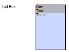
Figure 4. List box example.
RadioButton
The RadioButton class inherits from the FormElement class. This example shows how to create a RadioButton and add it to the page.
RadioButton radio1 = new RadioButton( "Radio Button Name", 50, 25, 100, 75 );
radio1.DefaultChecked = true;
radio1.ExportValue = "abc";
radio1.ToolTip = "first";
RadioButton radio2 = new RadioButton( "Radio Button Name", 50, 140, 100, 75 );
radio2.ExportValue = "def";
radio2.ToolTip = "second";
RadioButton radio3 = new RadioButton( "Radio Button Name", 50, 250, 100, 75 );
radio3.ExportValue = "ghi";
radio3.ToolTip = "third";
Dim MyRadio1 As RadioButton = New RadioButton( "Radio Button Name", 50, 25, 100, 75 )
MyRadio1.DefaultChecked = true
MyRadio1.ExportValue = "abc"
MyRadio1.ToolTip = "first"
Dim MyRadio2 As RadioButton = New RadioButton( "Radio Button Name", 50, 140, 100, 75 )
MyRadio2.ExportValue = "def"
MyRadio2.ToolTip = "second"
Dim MyRadio3 As RadioButton = New RadioButton( "Radio Button Name", 50, 250, 100, 75 )
MyRadio3.ExportValue = "ghi"
MyRadio3.ToolTip = "third"

Figure 5. Radio button example.
Text Form Field
A TextField is a child class of FormElement. This example shows how to create a TextField and add it to a page.
TextField textField = new TextField( "Text Field Name", 50, 75, 150, 100 );
textField.TextAlign = Align.Center;
textField.BackgroundColor = RgbColor.AliceBlue;
textField.BorderColor = RgbColor.DeepPink;
textField.Font = Font.TimesItalic;
textField.FontSize = 16.0f;
textField.TextColor = RgbColor.Brown;
textField.DefaultValue = "ceTe Software";
textField.MultiLine = true;
textField.ToolTip = "Text";
Dim MyTextField As TextField = New TextField( "Text Field Name", 50, 75, 150, 100 )
MyTextField.TextAlign = Align.Center
MyTextField.BackgroundColor = RgbColor.AliceBlue
MyTextField.BorderColor = RgbColor.DeepPink
MyTextField.Font = Font.TimesItalic
MyTextField.FontSize = 16.0f
MyTextField.TextColor = RgbColor.Brown
MyTextField.DefaultValue = "ceTe Software"
MyTextField.MultiLine = true
MyTextField.ToolTip = "Text"

Figure 6. Text field example.
Signature Form Field
The Signature is a child class to the FormElement class. This example shows how to create a Signature and add it to the page.
Signature signature = new Signature("MySigField", 10, 10, 300, 100);
OpenTypeFont font  = new OpenTypeFont("fontname");
signature.Font = font;
signature.FullPanel.SetImage(@"C:\MyImage.gif");
signature.LeftPanel.TextColor = RgbColor.Red;
Dim MySignature As Signature = New Signature("MySigField", 10, 10, 300, 100)
Dim MyFont As OpenTypeFont = New OpenTypeFont("fontname")
MySignature.Font = MyFont
MySignature.FullPanel.SetImage("C:\MyImage.gif")

MySignature.LeftPanel.TextColor = RgbColor.Red
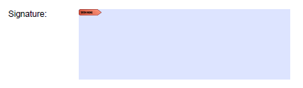
Figure 7. Signature example.
Signing a Form
The Signature form field element allows you to sign your PDF by requiring the end user to sign using a valid certificate. Using this field, you can require an end user to attest to the validity of the contents after saving the completed form. The client application, for instance, Adobe Acrobat, upon the user clicking the signature field, will kick off a series of dialogs guiding the user to sign. Figure 8 illustrates signing a form. It finds my installed user certificate and allows me to use it, draw a signature, or upload a signature. Then, after saving, the signature and the certificate become part of the completed form.
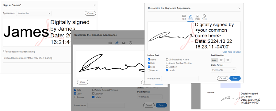
Figure 8. Signing a form example.
This topic refers to PDF Documents signed by the document end user. In this use case, a user clicks the PDF signature, and the PDF reader initiates a series of dialogs to guide the user through digitally signing and saving the document.
However, Core Suite also supports a document creator who signs a PDF document. As the PDF creator, you are signing your PDF to certify to your users that you attest to its contents in this second use case. See Digital Signing for more information.